Team Jerseys of the 2026 Tour De France — A Designer’s Perspective
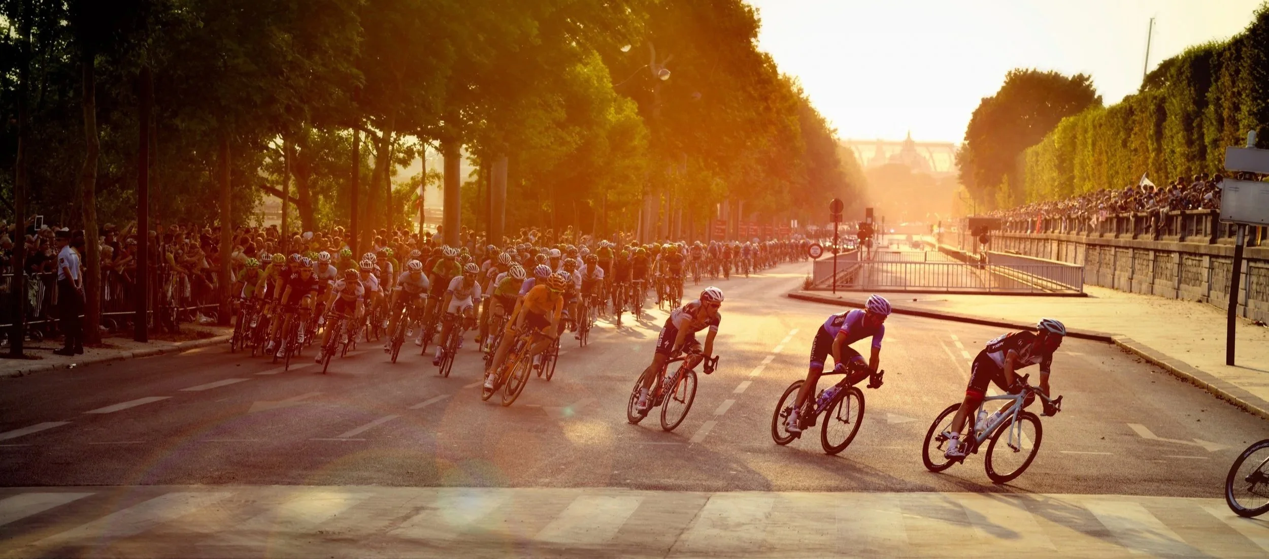
I'm not much of a sports fan—at least not in the traditional sense. I'm not the person who knows player statistics, follows every trade, or debates last night's game over coffee. In fact, I've never really been drawn to spectator sports, and even admit a mild aversion to sports entertainment altogether.
Then Grand Tour season arrives.
For three months each year, I become a devoted cycling fan, checking race data throughout the day, watching stage highlights, and, whenever my schedule allows, settling in for an entire stage—a commitment that can easily stretch to five or six hours. The season reaches its peak every July, when millions of people around the world tune in for the Tour de France, a three-week race widely regarded as one of the most physically demanding competitions in sport.
But this story is not about sports. This is about graphic design.
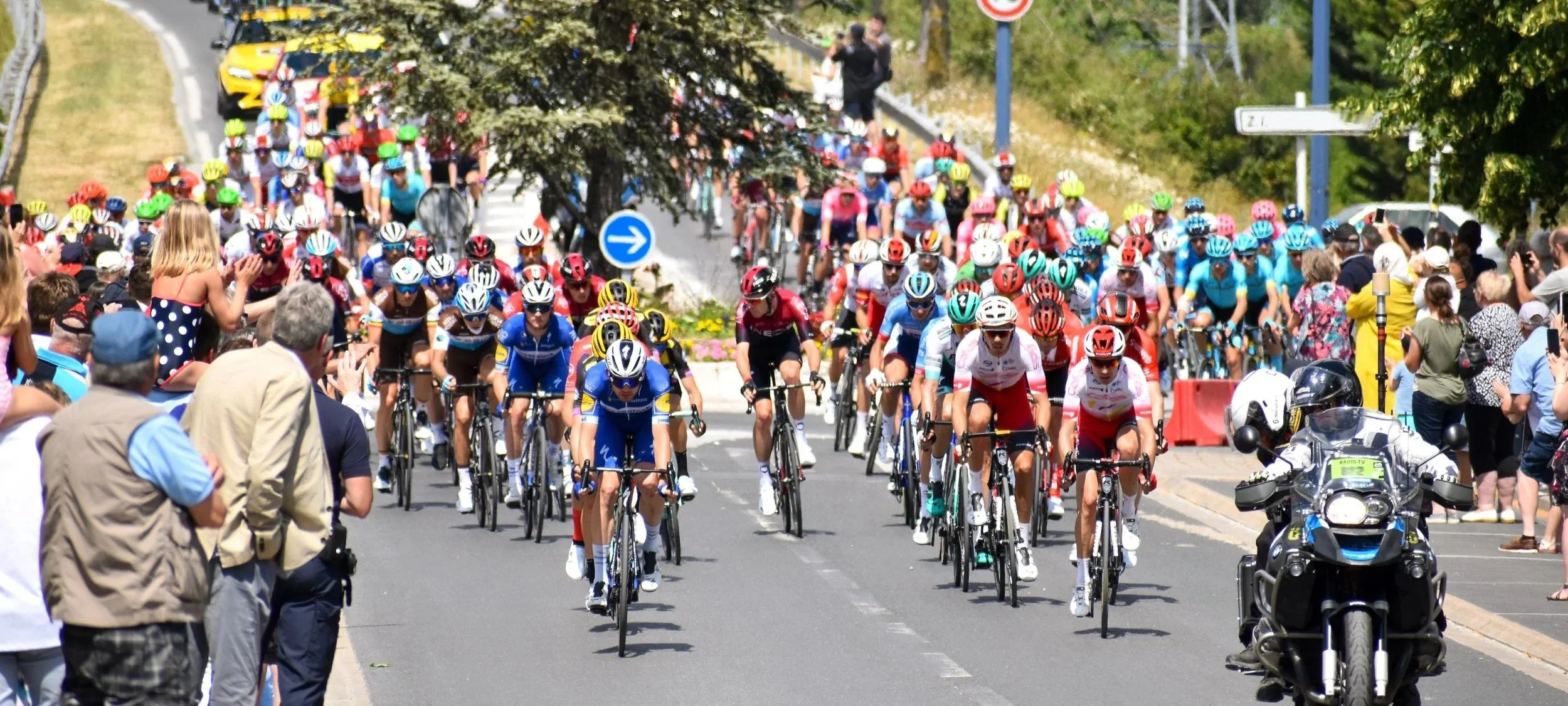
Not only is the pro peloton one of the most difficult athletic events of the year, it’s also one of the most demanding design environments in the sports world.
Just look at the photo above: there is no stadium or court where sponsors’ logos can sit stationary in view of fans and cameras. Instead, every team’s jersey must function simultaneously as a sponsor platform, team identifier, broadcast graphic, and performance garment. It has to remain recognizable from roadside crowds, television cameras, and helicopters hundreds of feet overhead—all while moving at race speed.
It’s a massive challenge for a graphic designer. Each jersey is a branding exercise under extreme constraints: dozens of sponsor logos, technical apparel requirements, global television coverage, and a need to stand apart from twenty-one competing teams. Most jersey designs struggle to balance those competing demands, and a few are just plain ugly. But some manage to rise above and create something genuinely beautiful.
Viewed through the lens of a branding consultant rather than a cycling fan, the best jerseys in the peloton aren't just attractive. They're masterclasses in hierarchy, differentiation, and brand expression. I’d like to highlight a few teams that are getting it right. This is not an exhaustive review of the best and worst, it’s just a take on the designs that stand out from the pack.
NSN Cycling
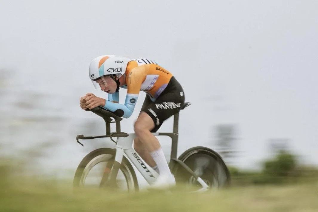
The freshest, most original jersey design that I’ve seen in the peloton for a long time.
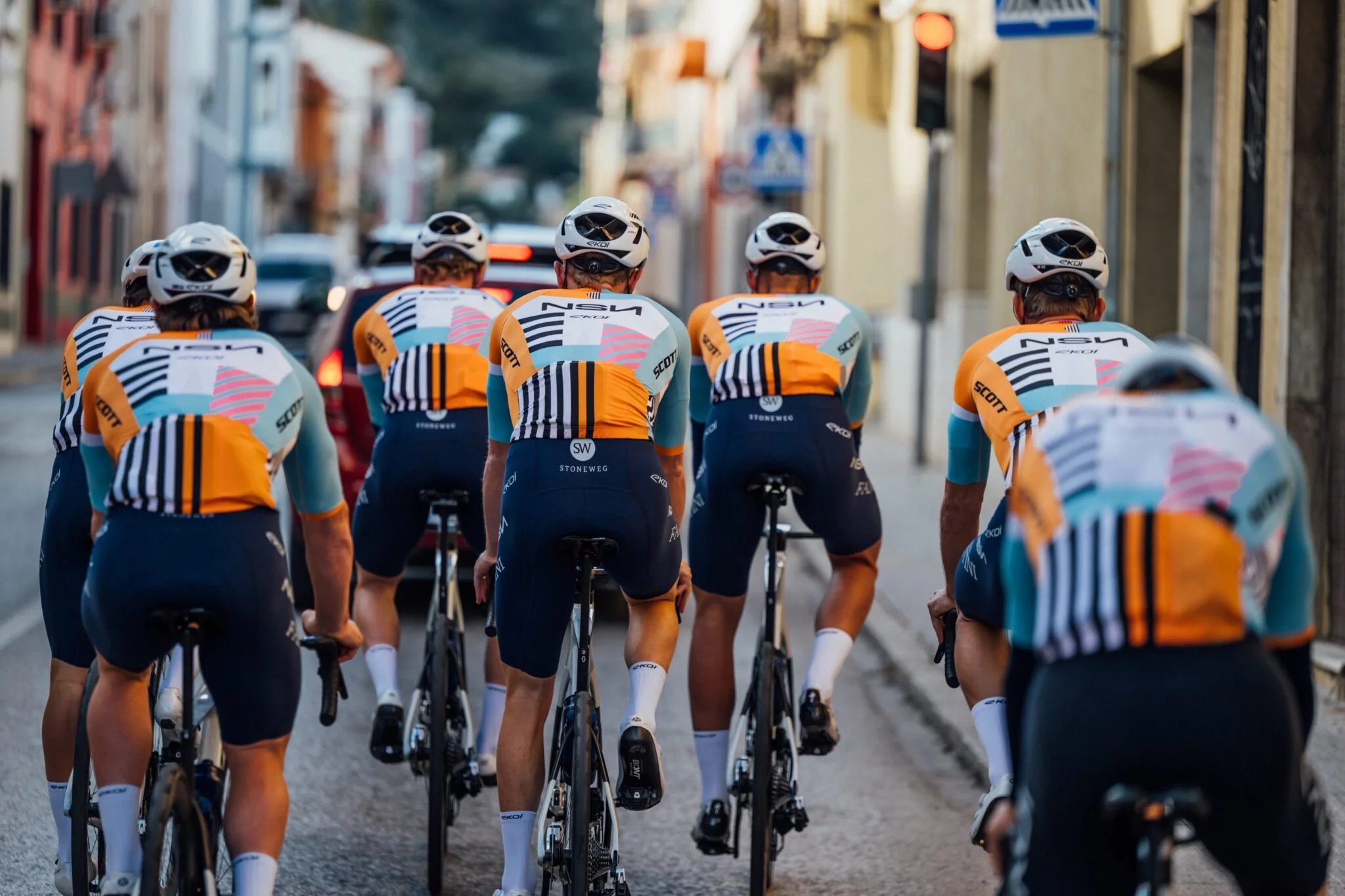
Photo borrowed from NCN Cycling
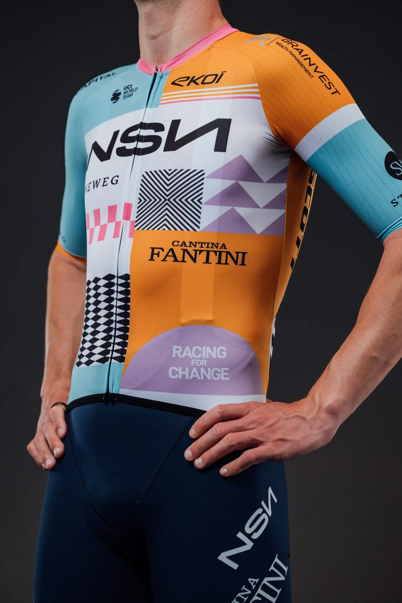
This is by far the best cycling jersey of the season, and probably the best I’ve seen since I got into the sport a decade ago. Other teams will put bigger, bolder logos on every conceivable panel of visible fabric — to the exclusion of any design or decoration that serves to give the team’s look a personality. But when you examine the NSN jersey, you get the sense that they wanted to make a beautiful jersey first, then apply the sponsor branding. It’s a stunning design, and it’s rooted in real meaning for the Spanish team. The NSN website explains:
Introducing our 2026 jersey, inspired by NSN’s home city of Barcelona. Its design blends geometry, color blocks, and patterns reminiscent of contemporary BCN. This is a city that never stands still, where tradition meets modernity, movement becomes identity, and where people dare to dream big.
The team also names its designer! A move I’ve rarely seen:
Our jersey was designed by Stijn Dossche of stycle.design and produced by Ekoï. It will make its debut in the UCI WorldTour at the Tour Down Under (Tuesday 20 – Sunday 25 January) in Australia.
Good design like this doesn’t just happen, it takes effort, imagination and curiosity. It’s clear that the NSN team appreciates the power of good design and wanted their jersey to be created with intention.
I’m thrilled to see such a great looking jersey in the pro peloton this year. I hope more teams and their sponsors embrace this aesthetic and engage professional designers to create jerseys with a true sense of place and purpose. After all, even though the sponsor logos are a bit smaller, I believe the good design will ultimately command more attention and respect for the team and its sponsors.
Bravo Stijn and NSN!
Netcompany | INEOS
A sponsor-focused design done right.
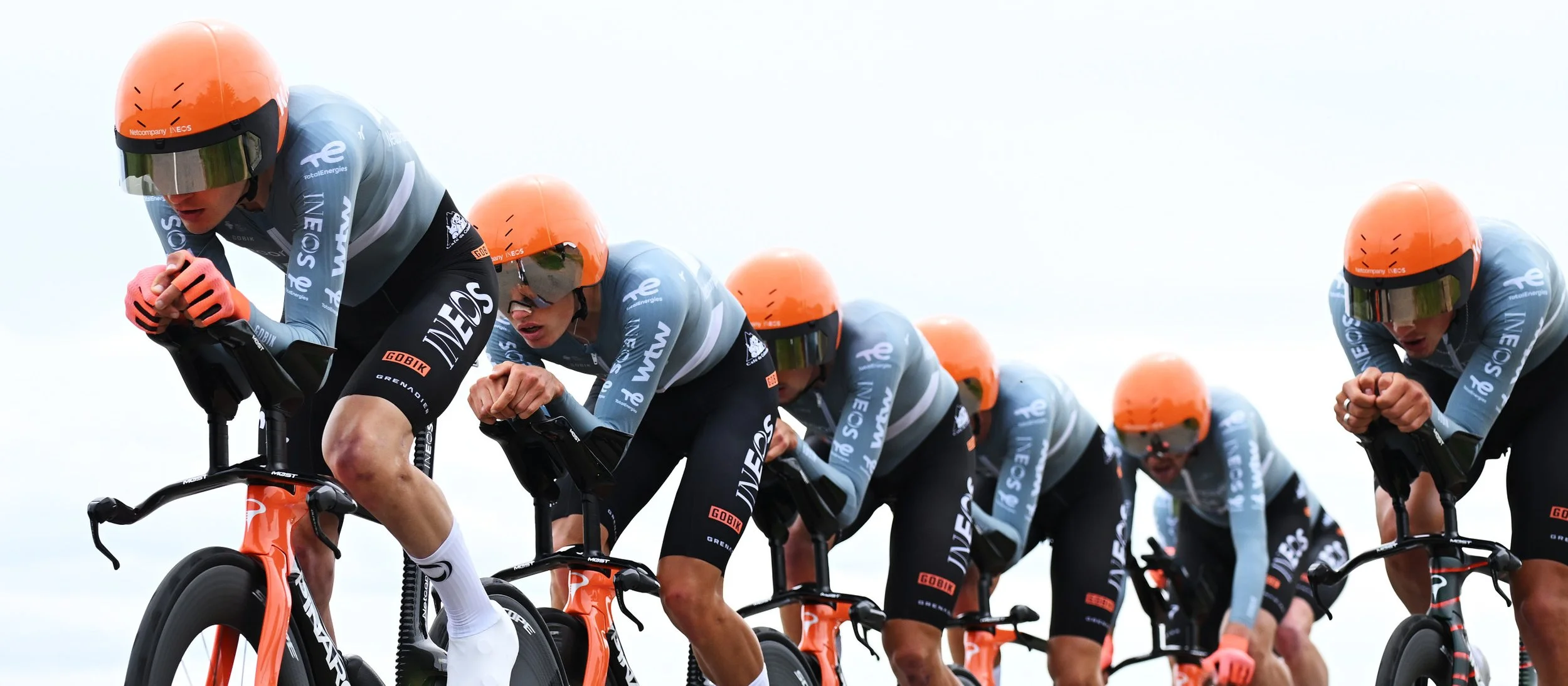
Image borrowed from Net Company INEOS
When I first spotted Netcompany INEOS in the peloton of the Giro D’Italia I was floored — the orange helmets and bikes screamed for attention among the pack of riders. And in that team time trial, they were a stunning blur of black, gray and orange.
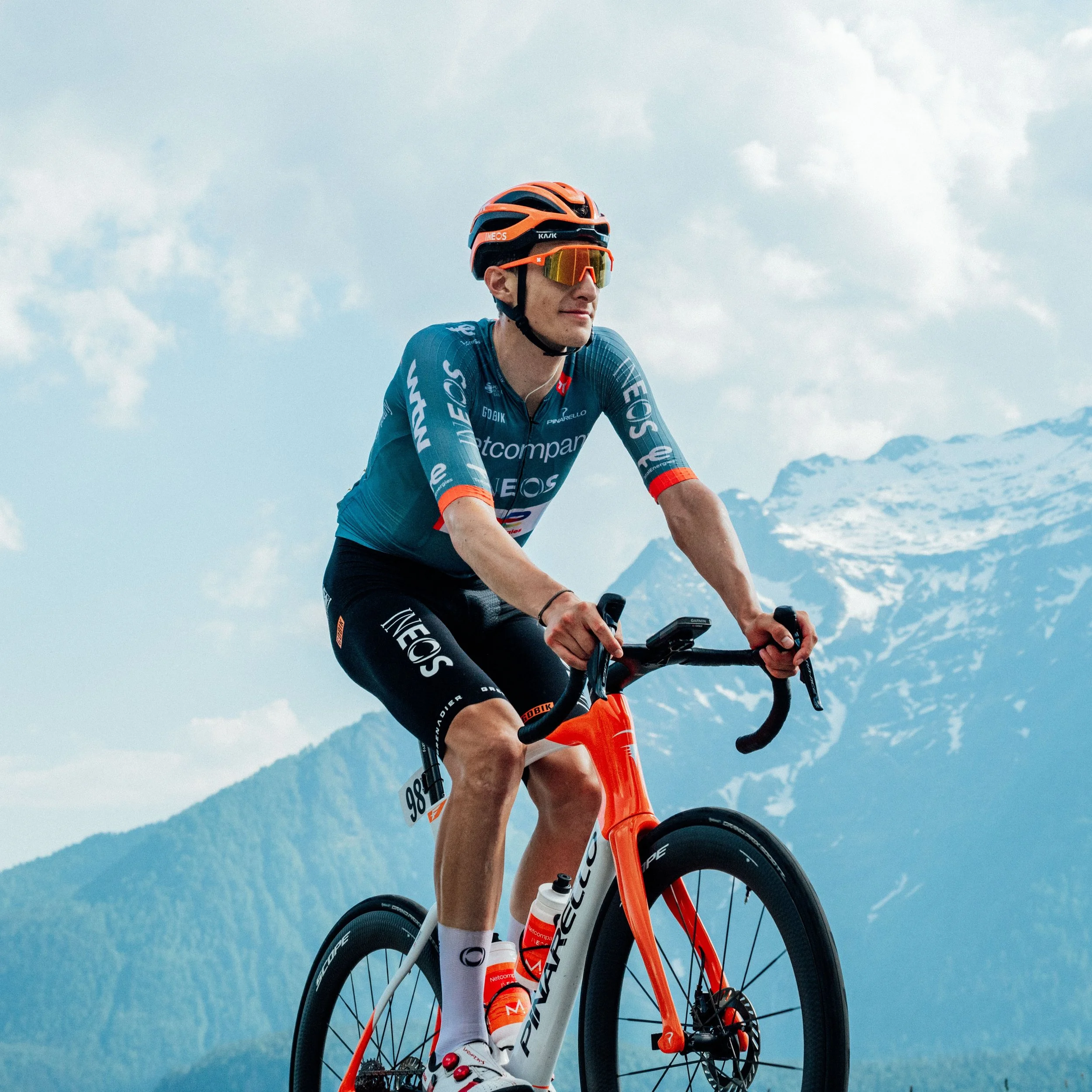
Image borrowed from Net Company INEOS
The design is rather simple. And, frankly, it’s not that complicated. Just a gray jersey, paired with white or black bibles, covered in logos. It actually lacks the decorative design flare of NSN and leans toward pure utility. But even a utility-driven design can be beautiful if it’s done right, and there’s evidence of truly holistic thinking and remarkable restraint in this kit. Notice that all of the logos, regardless of placement or prominence, are applied in white or black. This allows the gray and orange color theme to remain consistent and clean. And the bright orange helmet and gloves mirroring the orange fork on the bike provide an anchor for the ensemble. That orange grabs your eye — no one else is wearing it — and it looks so fresh amidst the sea of black, red and yellow common in the rest of the peloton.
So even though there’s little graphic design flourish or originality like the NSN team, it’s clear that a designer was making thoughtful choices to bring a lot of information together into a surprisingly clean, snappy, fresh design. I’d wear a stripped-down logo-less version of this kit in a heartbeat, and that’s about the best compliment I can give.
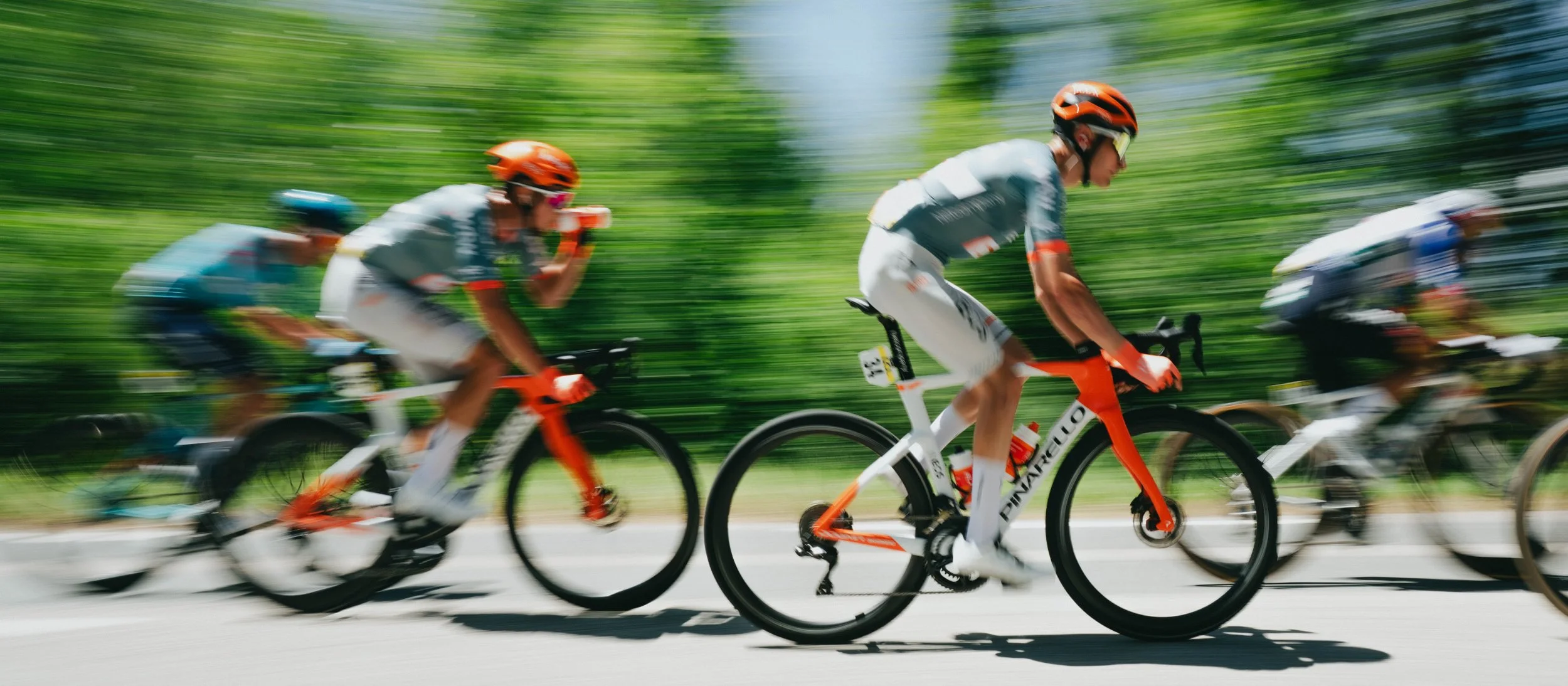
Image borrowed from Net Company INEOS
EF Education
The Pink Machine.
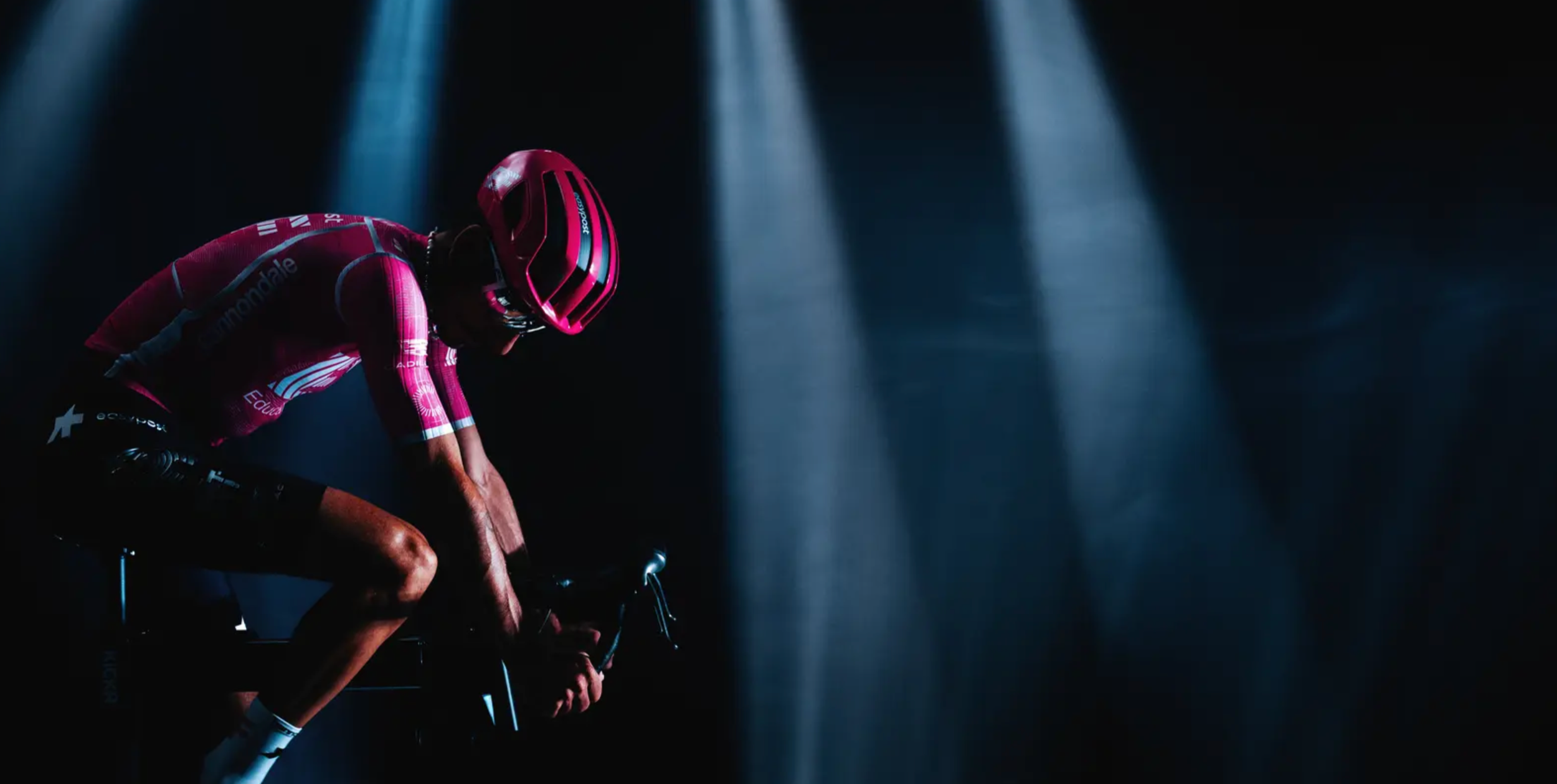
These photos borrowed from EF Education
I've had a soft spot for this team ever since its days as Cannondale around 2013, when sprinter Peter Sagan was the face of the squad. Back then they were known as the "Green Machine," thanks to a bold, unmistakable green kit. As riders came and went and sponsors changed, the team reinvented itself—trading green for pink.
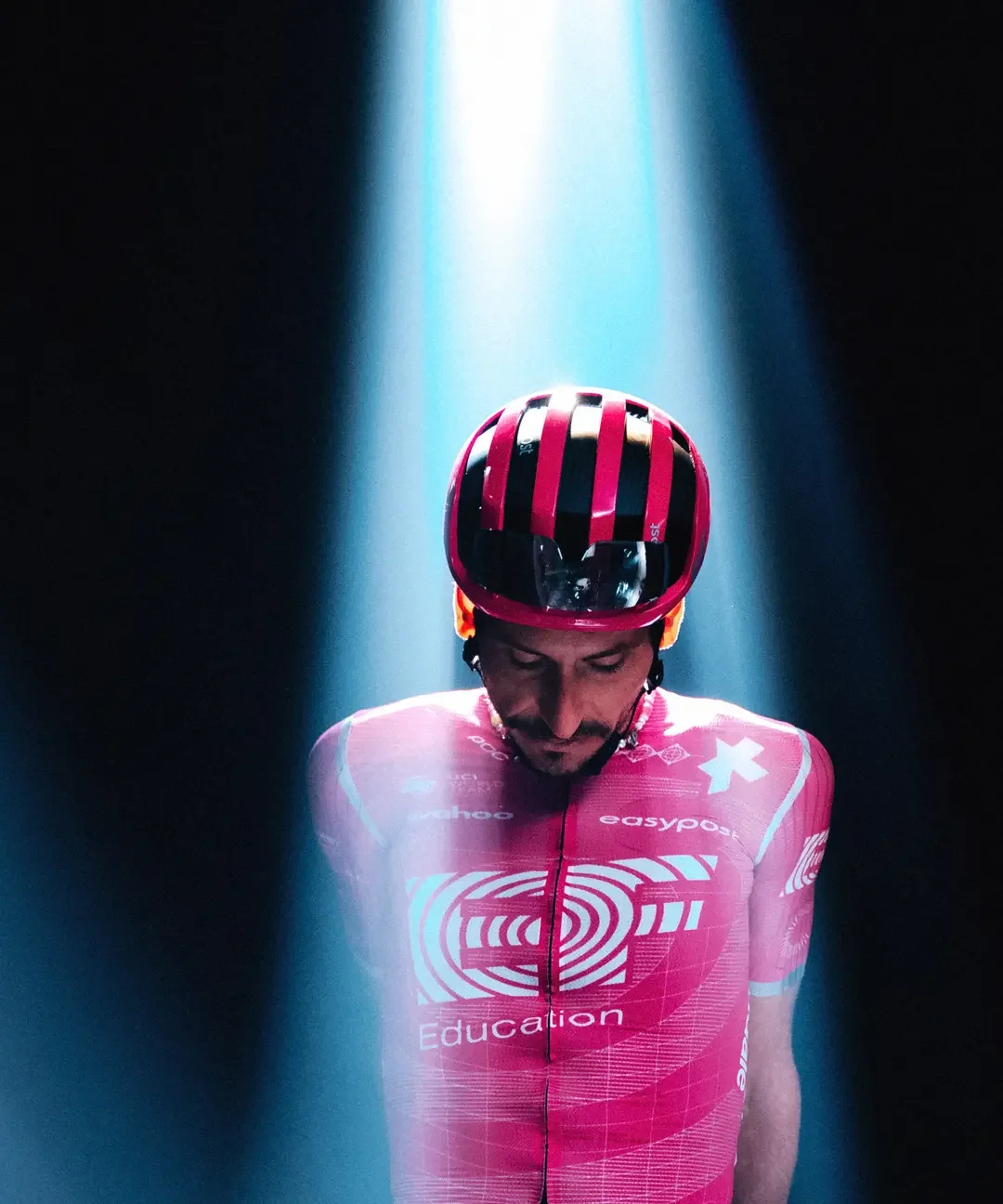
Borrowed from EF Education
Or magenta. Whatever the exact Pantone, they've committed completely to a color that no one else in the peloton owns.
That could have been a disaster. Instead, it's one of the strongest brand identities in professional cycling. Like the INEOS jersey, its success comes from restraint — with the text, anyway. Clean white typography and thoughfully-placed logos are rendered in white, creating a disciplined visual hierarchy against the saturated background. Nothing competes with the primary color — a shocking blast of pink — everything works together to reinforce it.
Interestingly, I don't even like pink as a color. But I love this jersey. There's no flashy pattern or clever graphic concept here—just a intentional, well-executed identity that demonstrates how consistency, hierarchy, and confidence can make a simple design unforgettable.
And I give major props for the team’s website. EF education’s design is solid, and seems to be a cousin of Cannondale’s website (and Cannondale has some of the cleanest and most original graphic design and branding of any bike brand in the last decade). And just look at the care and personality given to this page announcing this year’s Tour De Grance roster? Or, visit this page and watch their sci-fi short film about designing their jersey with ASSOS. It’s all kind of over the top in a very lovable way. I get the sense that this is a fun, playful team with a real sense of style. Nice work!
I’m excited to see this team compete this year, and I hope Richard Carapaz or Ben Healy add the red polka dot jersey into the pink pack for EF Education.
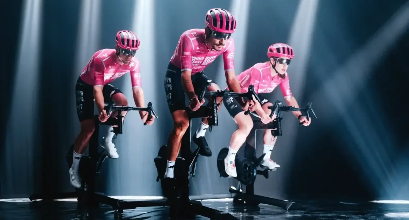
Borrowed from EF Education
Team Confidis
A kit only a designer could love.
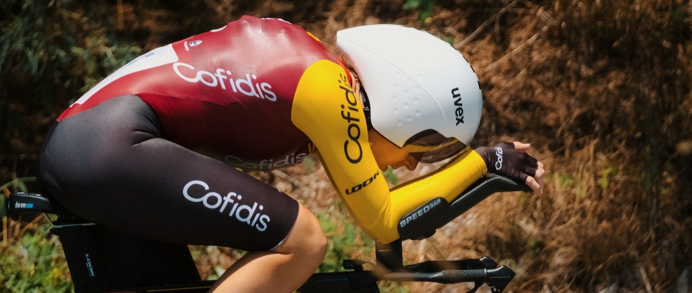
Photos kindly borrowed from Team Confidis
Every year, cycling magazines and blogs rank the best-looking jerseys in the professional peloton. Cofidis almost always ends up near the bottom.
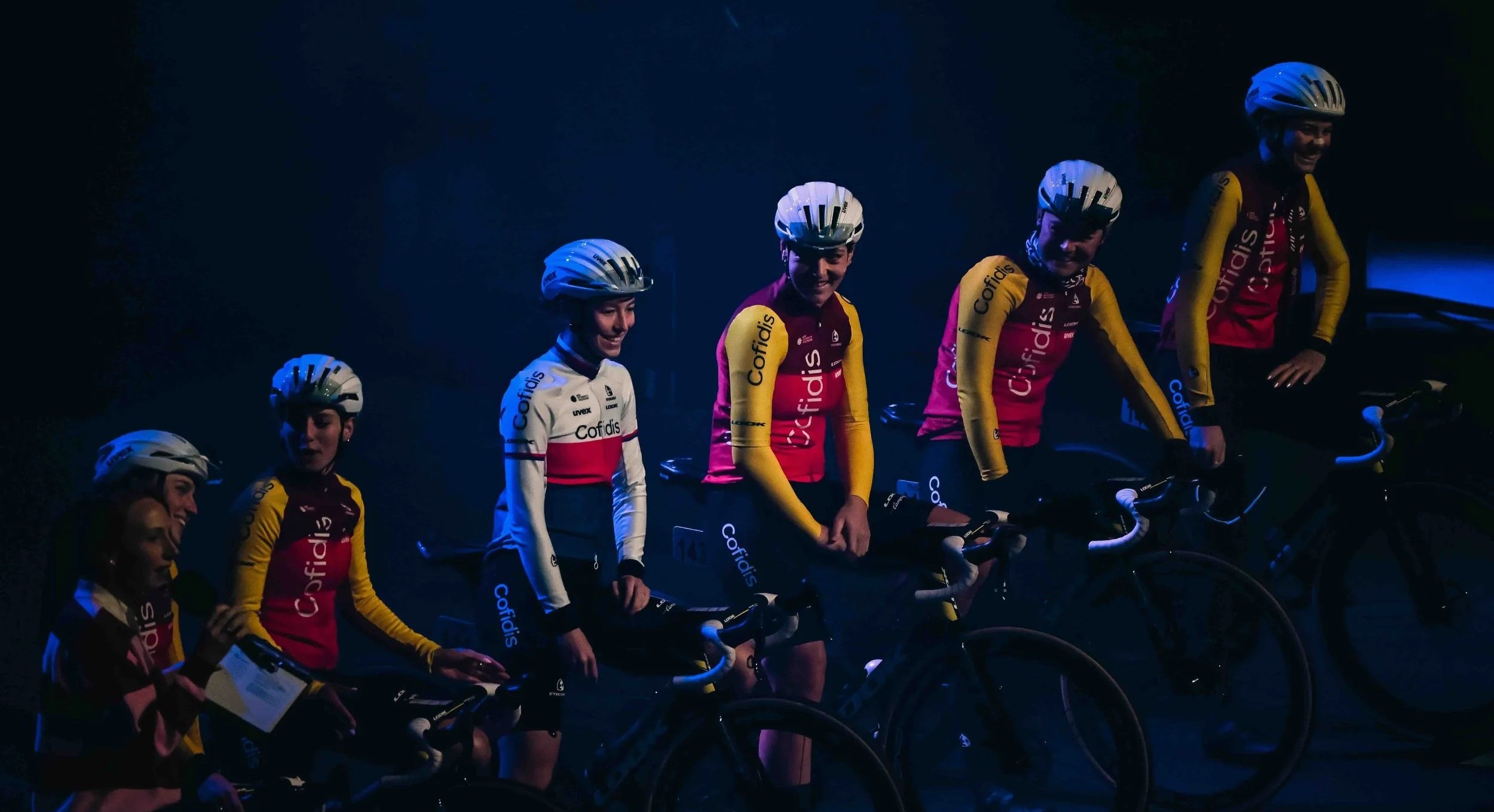
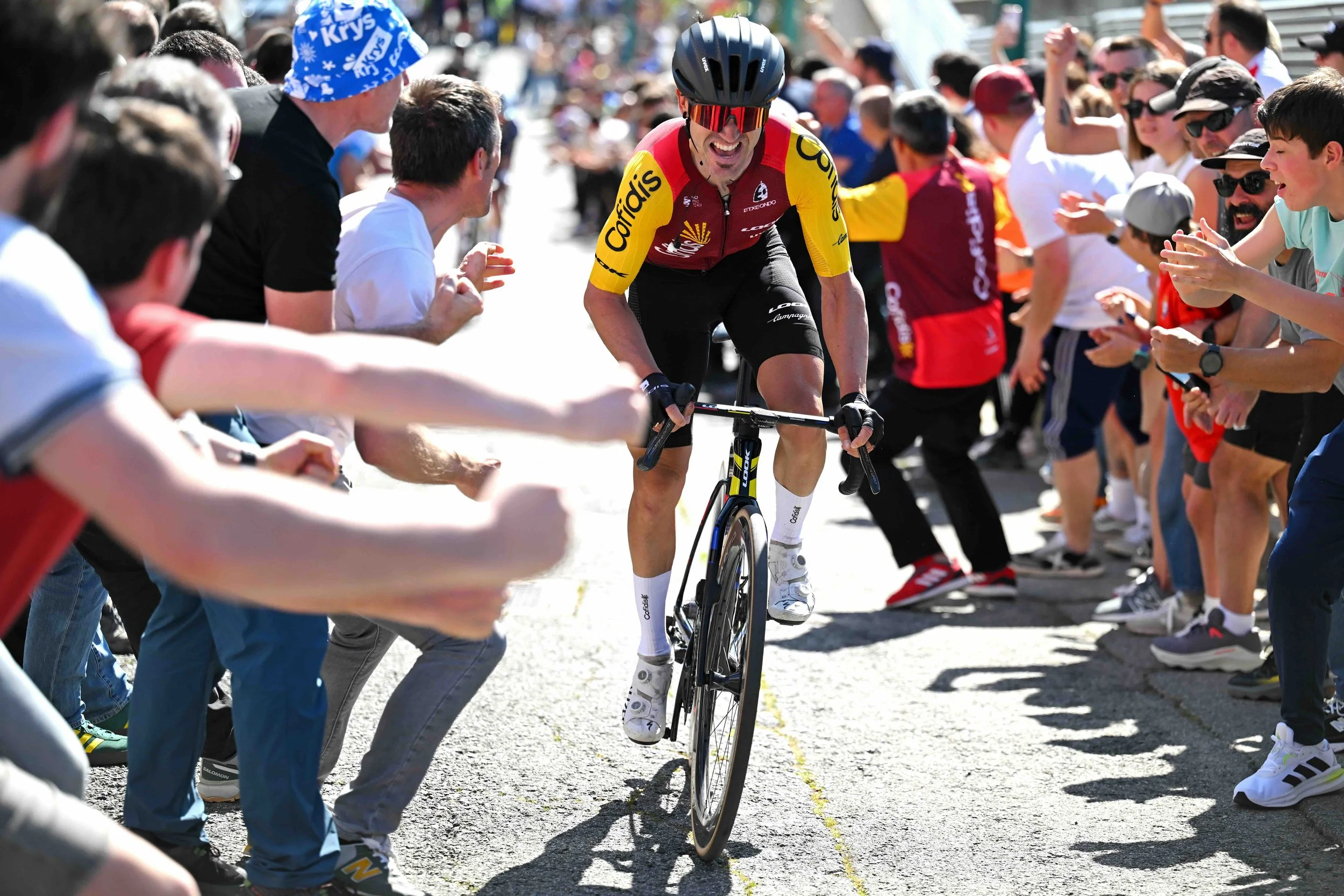
I understand why. Maroon, red, gold, and black isn't exactly the palette most people associate with high-performance sportswear. The gold sleeves, in particular, give the jersey a bold, blocky silhouette that's easy to dismiss at first glance.
So I guess that makes my argument rather unpopular: this is actually one of the best-designed jerseys in the Tour.
Here's why.
It's easy to forget that a team jersey isn't created in a vacuum. It's a branding exercise. Cofidis is a French financial services company whose visual identity is built around maroon, red, and gold. The jersey designers didn't invent this palette—they embraced it. Rather than forcing a trendy sportswear aesthetic, they translated the brand faithfully into a garment. There’s no one else out there who looks like them, and few who show off their key sponsor so well. It helps that the Confidis logo is a clean, easy to read word mark, too.
Borrowed from Team Confidis
And maybe it's just me, but the whole thing has a vintage vibe to it. The 70s colors palette feels like a cycling team from a Wes Anderson film. The vintage maroon-and-gold palette gives it a warmth and personality that I don't see anywhere else in the peloton.
The typography is clean and contemporary, the sponsor hierarchy is easy to read, and the color blocking creates a silhouette that's instantly recognizable in the middle of a fast-moving peloton. Whether you personally like the colors is almost beside the point. From a branding perspective, the jersey succeeds because it's distinctive, consistent, and unmistakably Cofidis.
It’s not perfect, but it is good design.
And Confidis, if you’re reading, I’d love a shot at designing your jerseys for next year. I have some great ideas!
Borrowed from Team Confidis
HONORABLE MENTIONS
Tudor and Movistar
Clean and focused, but a little boring.
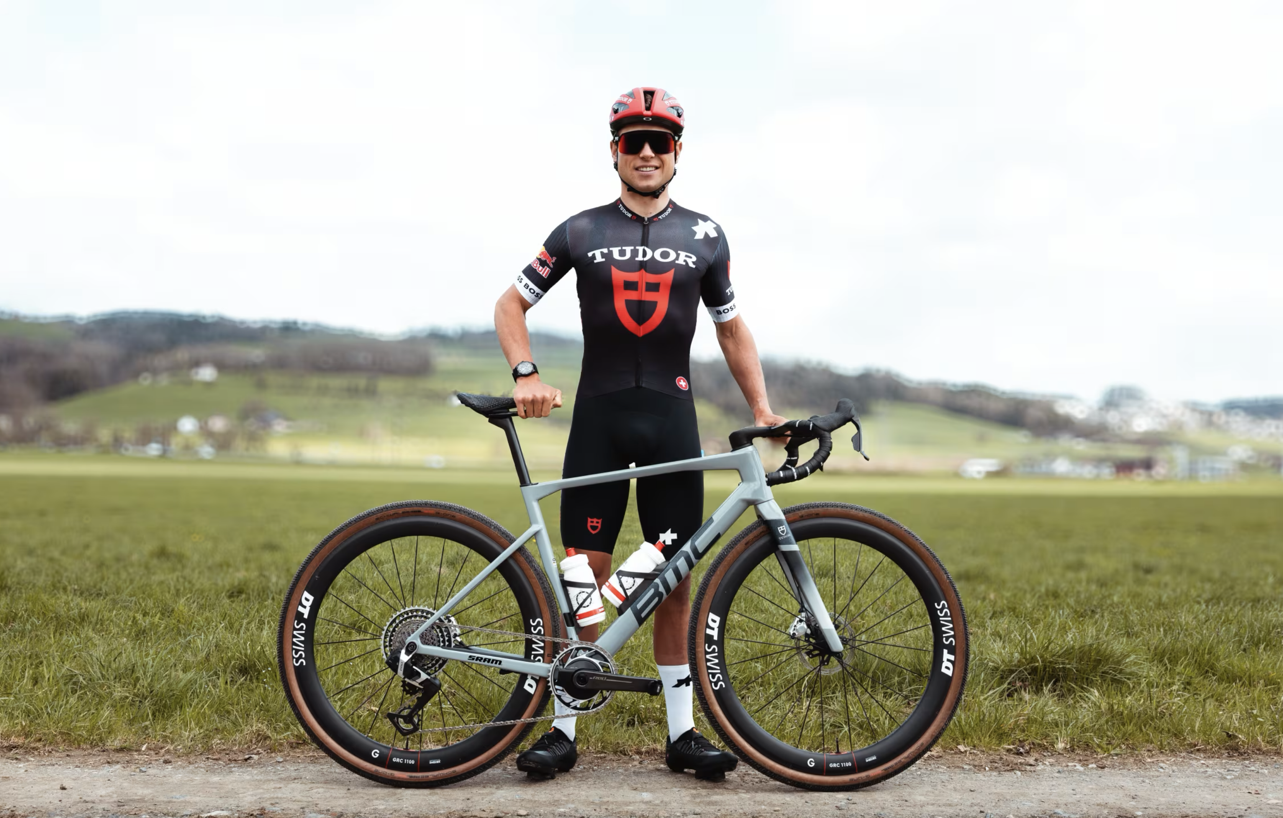
I’m going to throw both of these teams in the mix because they. The designs aren’t the most interesting, but they are simple. Dedicated to one big logo, and eschewing any other decoration. On paper, their designs are ideal. And, I do like both of these Jerseys designs, they’re just lacking a little something special.
Let’s start with TUDOR.
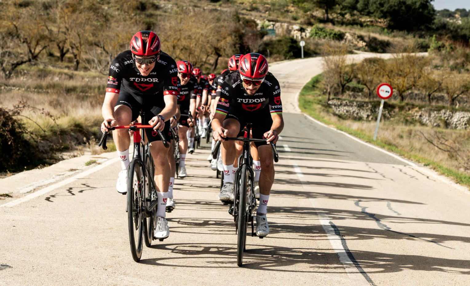
This team embraces a menacing black kit emblazoned with a stately TUDOR shield to command your attention. If you read this blog, you know I’m a watch enthusiast. And I love TUDOR (I really want a Tudor Ranger with the beige dial). But here the logo seems almost too big, and its placement just a little clunky. With so much space with which to work, I feel they couldn’t been a little more imaginitive.
I do love their bikes though. BMC’s are gorgeous bikes, and a gray frame with tan sidewall tires is pretty much my favorite colorway for any bike.
Next up, Movistar.
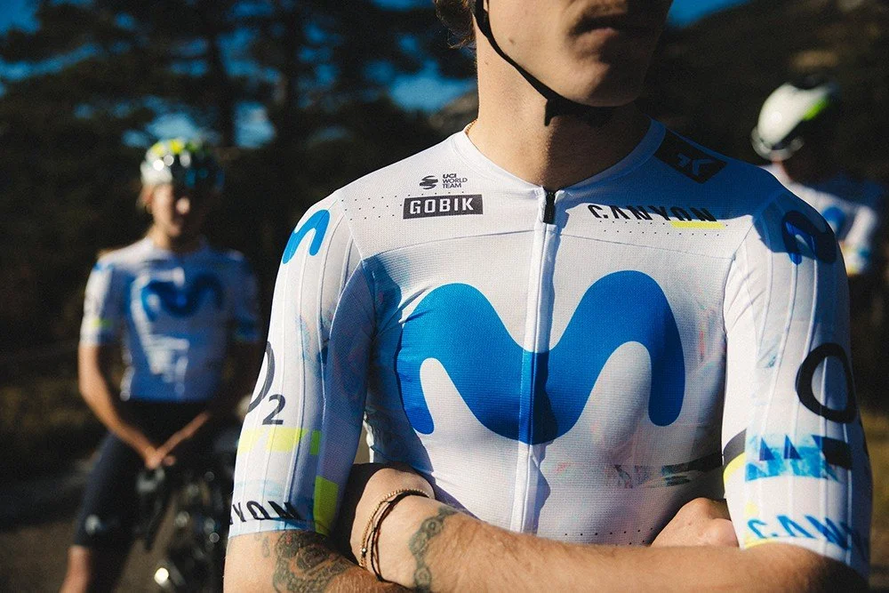
they’ve always had an elite look. Back in the Christopher Froome years, the team wore all black and moved through the peloton like a dark stealth fighter. They were fast and they looked menacingly cool. And it helps that the Movistar brand has a modern and clean design to begin with. The blue M squiggle is cool and organizc and unlike any over sponsor out there. They are one of the few where the icon stands alone and you need little else to know who they represent. The currents kits are white instead of black. The big blue M is airy, and cool — giving them a swiftness that makes them look faster and smoother than other predominantly white brands in the peloton (including Pogacar and the UAE Arab Emirates).
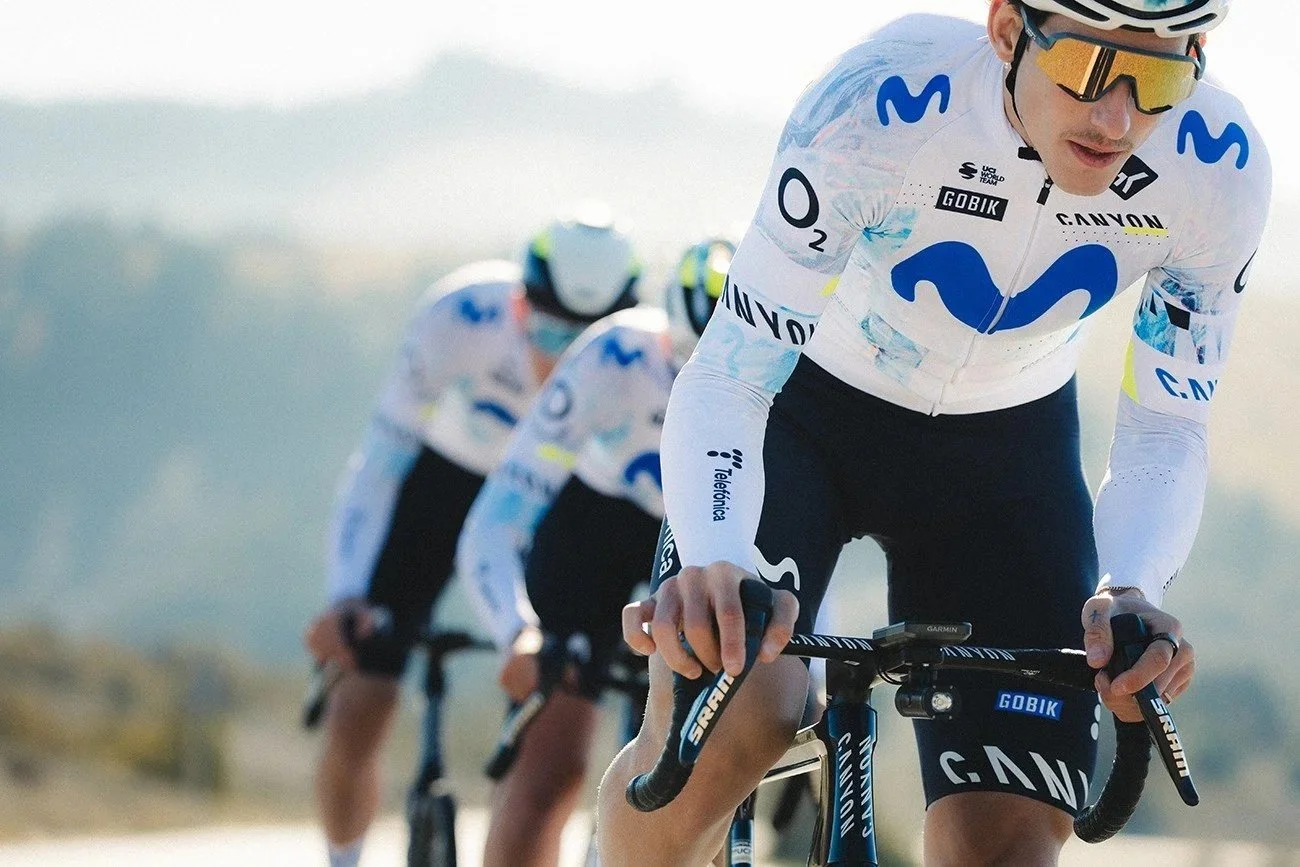
But, again, I think there’s lost potential here. Look closely and there are little splashes of texture and color on the sleeves and shoulders. These get completely lost unless from any more than an arm’s length. The end up making the design look messy. Tertiery logo placement is someone random. The helmet and shoe color choices are lost opportunity.
I still think these are great jerseys — a design success. But, in both cases, they feels a little boring compared to what team’s like NSN are doing. And even though they employ restraint similarly to INEOS Grenadiers or EF Education, they are lacking a unique angle and a holistic design thinking that would have made the kits truly stand apart.
That concludes my assessment of my favorite Tour De France jerseys of 2026. Thanks for reading!
Now, it’s Saturday, July 4th. The grand depart is happening in just a few hours in Barcelona. It’s time to descend into three weeks of cycling geekery. It’s a mountainous race this year, so it’ll be a climber’s race this year. And that, to me, always makes the race more fun to watch.
In case you’re wondering, I’m a Jonas Vingagaard fan. He’s riding strong this year, already winning the Giro D’Italia. Can he beat Tadej Pogacar? Not sure, but I really hope he gives Tadej a run for his money and we get to see their epic — but gentlemanly — rivalry play out all the way to Paris.
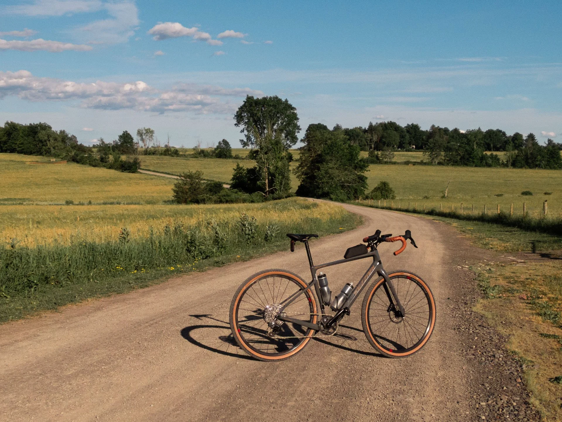
My unabashed plea to all cycling gurus: hire me!
If you happen to work for a cycling brand, racing team, bike shop, or any other cycling related thing — I want to work with you!
I’m nuts about bikes and design. So let’s talk!